Reading the Map: Navigation, Legends, and Color Coding
Learn how to interpret the visual data on your Mind Map to instantly understand your study performance.
Last updated 4 months ago
Once your Mind Maps is open, you will see various "nodes" (bubbles) connected by lines. To get the most out of this feature, you need to understand how to navigate the canvas and, most importantly, what the colors mean.
Navigating the Canvas
Zoom & Pan: Use the controls in the bottom-left corner to zoom in (+) or out (-). You can also click and drag the background to move around the map.
Re-center: Getting lost? Click the "🎯 Center" button to snap the view back to the middle.
Expand/Collapse: Click on a folder node to reveal or hide the files inside it. This helps keep your view clean.
The Legend: Color vs. Intensity
The Mind Maps uses a smart color-coding system to tell you two things at once:
how much you've studied and how well you know the material.
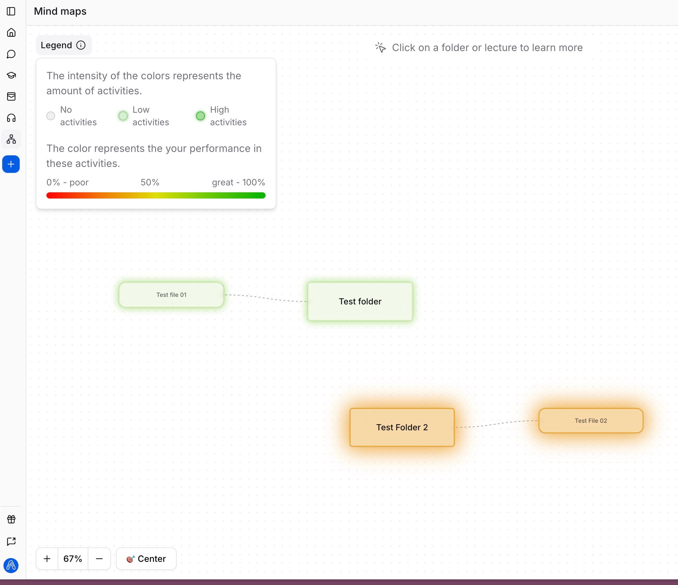
Check the Legend: In the top-left corner, you can toggle the "Legend" dropdown to see the scale.
Color (Performance): The color of the node represents your average score.
Red/Orange: Indicates "Poor" performance (0-50%). These are areas that need immediate attention.
Green: Indicates "Great" performance (near 100%). You have mastered these topics.
Intensity (Engagement): The brightness or saturation of the node represents the amount of activity.
Faded/Grey: Low activity. You haven't interacted with this file.
Bright/Solid: High activity. You have spent a lot of time here.